Thinking PRPL - A Progressive Web Pattern
The PRPL pattern is not a specific technology or tool, but rather a methodology for building web applications that load fast and reliably.
- First and foremost, you send (push) the most critical resources to your users.
- You do this in order to render your initial route as soon as possible.
- You then pre-cache remaining assets.
- Finally, you can consider lazy loading your routes.
The term PRPL was coined by the Polymer team in their talk at Google I/O 2016.
Mobile Web
It is probably safe to assume that the majority of individuals who read this article own a mobile device, and the amount of time that we spend on our smartphones and tablets have only increased year after year.
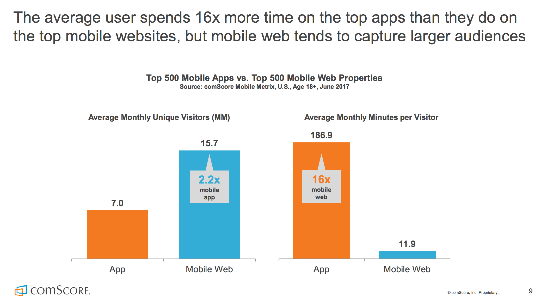
In comScore’s 2017 U.S. Mobile App Report, it was found that the average user spends 16x more time on popular native apps than the mobile web. As mobile device consumers, we are far more likely to spend more time on native apps than we do on the mobile browser. However, mobile web pages still received over twice as many unique monthly visitors than native apps. This is due to a multitude of reasons, including the convenience, security and simplicity of just typing a URL into an address bar instead of installing an entire application.
So how can we ensure that users who discover our web pages have a great experience regardless of what device they use? There are quite a few ways, and we’ll go through some specific techniques and resource hints in this article. But before we do that, let’s take a little time to talk about how the web works first.
When we open a browser on a mobile device (or tablet or desktop) and type something into the address bar and press Enter, a request is sent to a remote server somewhere.
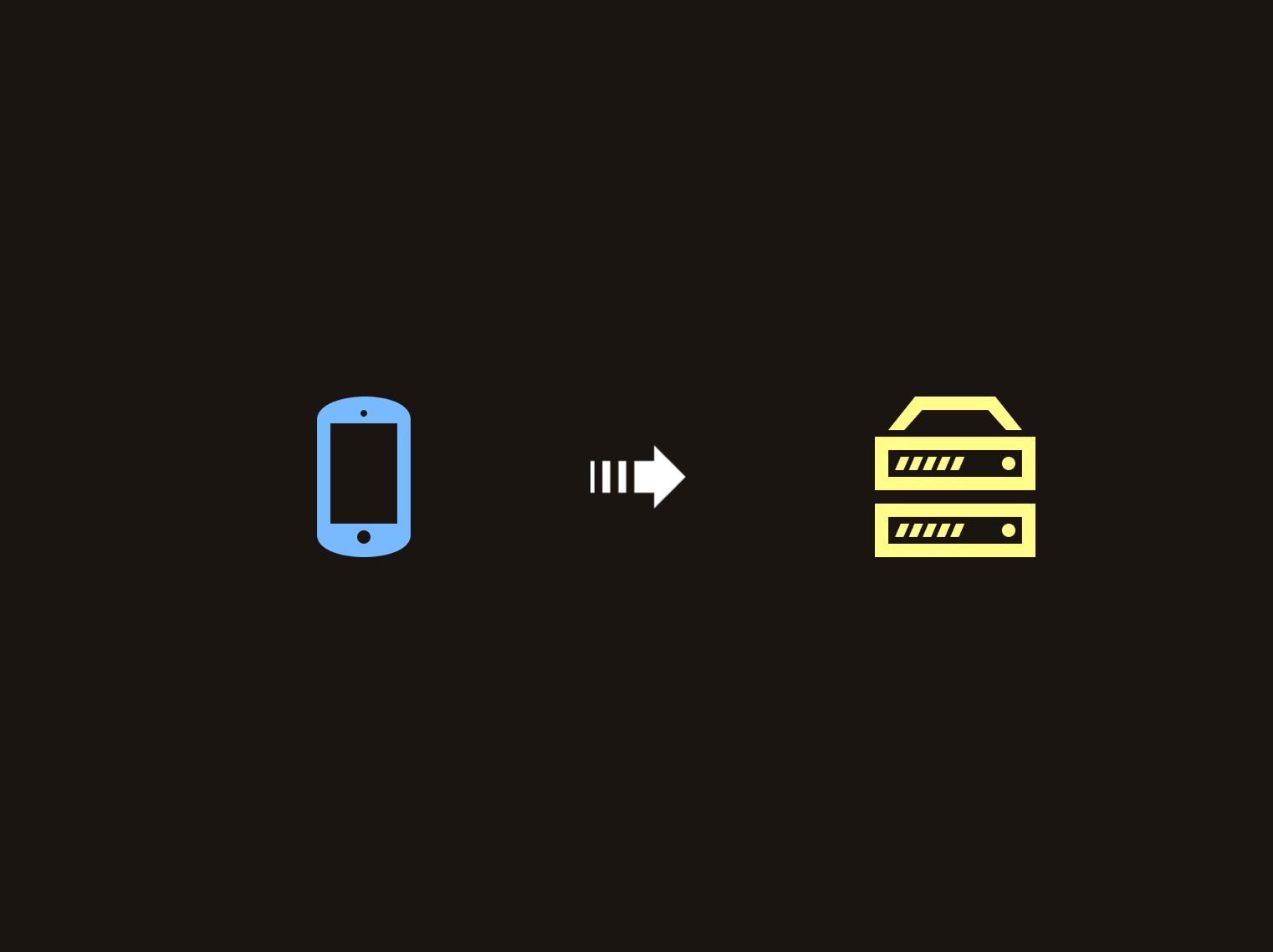
After a certain period of time, the server responds with content that the browser needs. This usually takes shape of an HTML document. The underlying application protocol used by the web (HTTP) works using this request-response pattern.
Once the browser retrieves the initial HTML document, the next thing it does is parse through the contents of the file in order to determine what other resources it needs. For each external resource that it finds, it submits a separate request for it. These resources can include CSS files for styling, JavaScript for dynamic content or even static images. Multiple round trips are usually needed for a typical webpage in order to get all of the content that the user needs to see.
Link Preload
Let’s assume that the following markup represents the HTML document that our browser receives on the initial request:
<html lang="en">
   <head>
      <link rel="stylesheet" href="styles.css">
   </head>
   <body>
      <!--(>'-')> <('-'<)-->
      <script src="script.js"></script>
   </body>
</html>
We can see that there’s a style sheet file that is referenced as well as a JavaScript file. One thing we can do in order to help the fact that multiple requests are needed is to leverage preload:
<html lang="en">
   <head>
      <link rel="preload" as="script" href="script.js">
      <link rel="stylesheet" href="styles.css">
   </head>
   <body>
      <!--(>'-')> <('-'<)-->
      <script src="script.js"></script>
   </body>
</html>
The preload hint has a syntax that a lot of us may already be familiar with:
<link rel="preload" as="script" href="script.js">It’s a <link> element where we define the location of the file as an href attribute. We specify the preload keyword using the rel attribute and the type of file we’re trying to load using as. In this case, we’re trying to preload a JavaScript file - hence why we’ve defined as="script".
Using preload allows us to inform the browser that a resource is needed immediately after the page loads. In other words, we’re telling the browser that this is a critical resource so please start loading it as soon as you can.
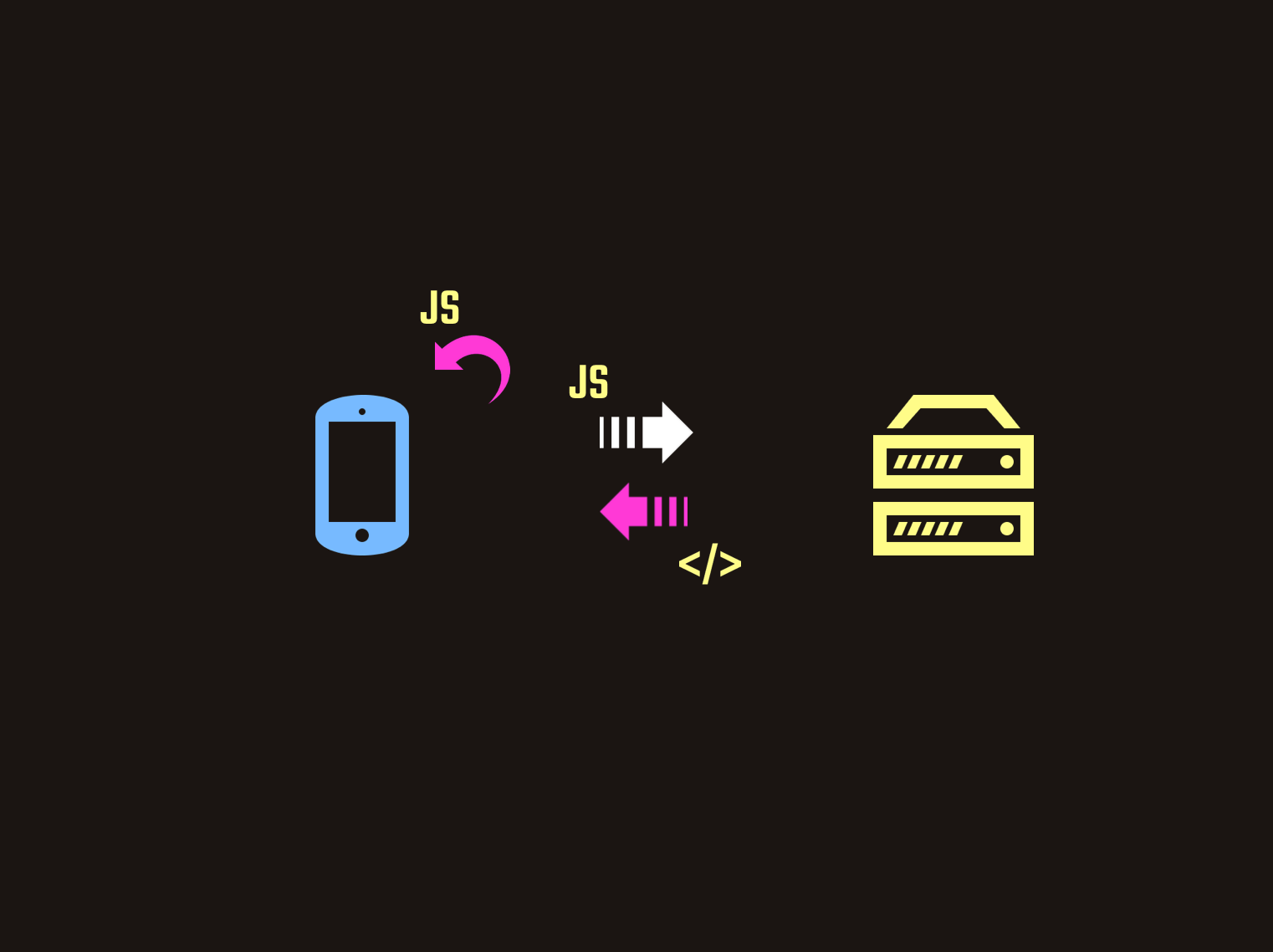
Although we can specify preload tags for resources defined in the head or body of our root HTML file, you’re more likely to get the most bang for your buck using preload for resources that might be discovered much later. An example of this could be a specific font tucked deep in one of your CSS files.
Style sheet and JavaScript files are not the only types of resources we can pre-emptively fetch using preload. Other types of content can be preloaded as well.
Link Prefetch
Instead of preload, we can also make use of a prefetch tag for some of our resources. The difference here is that prefetch is more suited for resources needed for a different navigation route. This means that the browser will know to fetch and cache this resource once it has completed loading the current page.
Although it may seem straightforward to add <link rel="preload"> and <link rel="prefetch"> tags to the head of your HTML document for static sites, it can be a little tricker if you happen to be using a module bundler for a single-page application. Fortunately, there are a number of potential tools that can make this easier:
- webpack 4.6.0 provides support for prefetching and preloading resources using ‘magic’ comments:
import(/* webpackPreload: true */ "PreloadedPage")

import(/* webpackPrefetch: true */ "PrefetchedPage")- If you happen to be using an older version of webpack:
- preload-webpack-plugin is a webpack plugin that allows you to define dynamically generated chunks (as a result of code-splitting) as preloaded or prefetched resources. This plugin is supposed to be used alongside html-webpack-plugin.
- script-ext-html-webpack-plugin is an extension of html-webpack-plugin and can be used to attach custom attributes and resource hints to generated chunks, including
preloadandprefetch.
Browser Support
At the time of writing this article, the browser support for preload is as follows:
HTTP/2 Server Push
We’ve just covered how we can use <link rel="preload"> to load critical resources as early as possible, but another useful point of topic is HTTP/2 Server Push. In short, HTTP/2 is a revision of HTTP and aims to provide a number of performance improvements. For the purpose of this article, we’re only going to focus on Server Push.
The idea behind Server Push is that when we send down the initial HTML document during our first request/response interaction, we can also send down (or push) critical assets at the same time. These are assets we know the browser will need before it even knows it needs them itself.
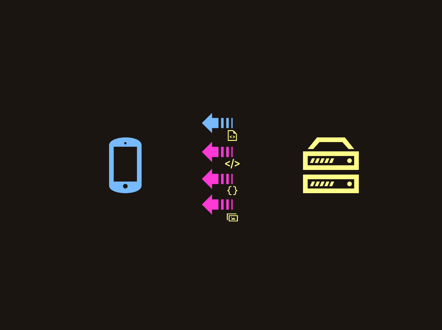
One of the primary benefits of using Server Push is that it can minimize round trips to the server. We can remove the time it takes the browser to parse the contents of the HTML file and fire subsequent requests for any assets that it finds which can result in shorter page load times.
One thing we didn’t mention earlier about preload is that instead of using HTML tags, we can also specify HTTP headers:
Link: </app/style.css>; rel=preload; as=style
Link: </app/script.js>; rel=preload; as=script
Many hosting platforms that support HTTP/2 Push will attempt to push assets down the wire when it sees that you’ve preloaded them using Link HTTP headers. Examples include Firebase Hosting and Netlify.
Server Push is experimental
Although page load times can be reduced with Server Push, it can actually harm performance if not used correctly. There are a number of reasons why this can happen:
- Pushing unused assets: The server has no idea which resources are being used by the client, and pushing assets that aren’t used can waste user bandwidth.
- Pushing too many assets: Pushing too many assets can cause performance hits. There’s no specific number of files you should be pushing and it can vary depending on how many resources the browser is trying to load. It is important to keep in mind that Server Push can overwrite the browser’s prioritization logic and you should try pushing assets with the correct order of loading.
- Pushing assets already cached by the browser: Ideally, we would want the browser to reject pushed resources if it already has it stored in one of its caches. Although the client can use settings to make this possible, each browser behaves differently and this can get a little tricky. Jake Archibald covers this in a little more detail in his excellent write-up about the nuances of HTTP/2 Push between different browsers.
Service Workers
Now let’s shift gears a bit and talk about the pre-cache concept in PRPL. I’ve briefly addressed service workers in my previous post about building progressive Angular applications, but we’ll dive a little deeper here.
A service worker is a script that runs in the background of your browser when you view a webpage. We can either create the service worker file and write the logic ourselves, or we can use libraries that can make this process easier. One example is Workbox, which provides a suite of libraries and tools that we can use. One of the tools that it provides is a CLI which we can install globally:
npm install workbox-cli --globalWe can run workbox wizard in our terminal to start the process. Workbox will then ask a series of questions in order to set up a service worker with the correct configurations:
What is the root of your web app?If you’re using a module bundler or have a build step in your application, you most likely have a final folder that you’ll need to deploy (for example:dist/orbuild/).Which file types would you like to precache?You can decide which file types you would like to precache.Where would you like your service worker file to be saved?You most likely would need to have your service worker saved in the folder you deploy, but you can specify where exactly.Where would you like to save these configuration settings?Workbox saves these settings into a separate configurations file (and you can decide where to save it).
The default answer for saving the configurations file is workbox-config.js at the root of your application. The generated file looks like this:
module.exports = {
  globDirectory: 'dist/',
  globPatterns: ['**/*.{js,png,svg,html,json}'],
  swDest: 'dist/service-worker.js',
};
Once we have our configurations file saved, simply running the following command creates a new service worker file:
workbox generateSW workbox-config.jsAlthough this creates a service worker file where we’ve asked it to, we still need to tell the browser to register it. We can do this by adding a <script> tag in index.html:
<script>
  if ('serviceWorker' in navigator) {
    window.addEventListener('load', function () {
      navigator.serviceWorker.register('/service-worker.js').then(function(){
        // Registration was successful
        console.log('ServiceWorker registration successful!');
      }).catch(function(err) {
        // registration failed :(
        console.log('ServiceWorker registration failed: ', err);
      });
    });
  }
</script>
In here, we check to see if service workers are supported in the browser. If they are, we register our service worker using navigator.serviceWorker.register(). To prevent the possibility of the service worker being registered at the same time as other resources are still being loaded to the DOM, we make sure to only register it after window.onload is complete with the use of an event listener. At the end, we have logs outputted to our console in the case of a successful registration or a failed one.
Application Shell
So we briefly covered how to install and register a service worker using Workbox, but we still haven’t mentioned how they work. One of the primary benefits of using a service worker is that they allow you to precache the resources that make up the Application Shell. Like the name suggests, the App Shell is the shell of your user interface.

Application Shell - Twitter Lite
The App Shell consists of all the HTML, CSS and JS that make up the parts of that application that don’t convey actual data (or dynamic data retrieved from a third-party location). Once the app is loaded for the first time, the assets that make up the shell can be retrieved over the network normally. A service worker can act like a middleman between the browser and the network allowing us to to cache these resources as well.

Storing the resources that make up the shell in the service worker cache means that when the user loads the application for a second time, the browser can retrieve them from the service worker instead of making network requests. This results in faster page loads on repeat visits.
Although using Workbox’s CLI can simplify creating a service worker, we would still need to remember to create a new one every time we make a change to our application. In this case, it might make more sense to integrate Workbox into our build system. For example, instead of installing the library globally - we can install it as a dependency:
npm install workbox-cli --save-devWe can then add it as part of our build step:
// package.json

"scripts": {
  //...
  "build": "{build} && workbox generateSW workbox-config.js"
}Dynamic Content
The next thing service workers allow us to do is pre-cache dynamic content. Just like the resources that make up the App Shell, this is data that can be retrieved from a third-party network. However, the difference here is that this is content that can change with subsequent page loads.
Let’s modify our configurations file, workbox-config.js, to add a runtimeCaching attribute:
module.exports = {
  globDirectory: 'dist/',
  globPatterns: ['**/*.{js,png,svg,html,json}'],
  swDest: 'dist/service-worker.js',
  runtimeCaching: [
    {
      urlPattern: /^https:\/\/your.api.com\/.*/,
      handler: 'networkFirst'
    }
  ]
};
With runtimeCaching, we can add an array of URL patterns and define a specific caching strategy for each. Different caching strategies allow us to control how our service worker can handle caching results fetched from a URL. In this example, we use the networkFirst strategy which means the service worker will always know to retrieve the contents from the network and serve it to the user. However, it will also always update its pre-cached results with the latest data. If the network happens to fail, the service worker will serve its cached information and the user can see older data instead of no data at all.
Although extremely useful for applications where data is changing frequently, networkFirst isn’t the only caching strategy we can use. Let’s quickly go over the others:
cacheFirst: If there is no cached data, a network request is made and the results are cached. After that, the cache will only serve its data and no network requests will be made. This can be useful for handling things in an offline-first manner.staleWhileRevalidate: Mostly suited for serving non-critical data to the user as fast as possible, this approach is used to serve cached data to the user quickly at first. A network request is also made in parallel with the request made to the cache. When the network request is complete, the cache is updated.cacheOnly: Only retrieve resources from the cache and do not rely on the network at all. However,cacheFirstis more commonly used for offline-first patterns.networkOnly: Only retrieve resources from the network and do not have any data cached. This may not be commonly used but may be suitable for data that cannot be cached.
Customize Service Worker
Although using the Workbox CLI can make getting a service worker up and running an extremely simple and straightforward process, there may be scenarios where we would need a little more control on how our service worker is created. This can be for a number of reasons:
- We have more complex pre-caching requirements than what Workbox provides out of the box.
- We want to take advantage of other service worker features (such as Web Push)
- We already have a service worker file and only need to incorporate some Workbox features in addition to it.
For any of these scenarios, we can use the injectManifest mode provided by Workbox:
workbox injectManifest workbox-config.jsBy using this flag, we not only need to provide a destination service worker location but the location of an existing service worker as a source as well.
Browser Support
At the time of writing, service workers are supported in all major browsers:
Bundles
Front-end development has changed a lot in the past few years. A large number of JavaScript libraries and frameworks have allowed us to add more client-side logic and functionality than ever before. Unfortunately, this can come at a cost of larger bundle sizes.
Although adding more and more JavaScript code to a large application will inevitably make our bundle sizes grow and grow, we can incorporate code splitting into our application to help. The idea behind code splitting is that instead of providing users with all of the code that makes up our application as soon as they navigate to the first page, we can try to give them pieces of the entire bundle that are only relevant to their current route. The browser can then make requests for more chunks of the bundle as the user navigates through the application. The concept of loading different pieces of a bundle on demand is called lazy loading.
Code splitting and lazy loading allow us to send smaller chunks to our users as well prioritize loading of specific chunks if we need to (with <link rel="preload"> for example). This can improve loading times significantly.
Angular’s routing framework has lazy loading built-in where we can use a loadChildren attribute to load a feature module on demand:
export const routes: Routes = [
  { path: '', redirectTo: 'main', pathMatch: 'full' },
  { path: 'main', component: MainComponent },
  { path: 'details', loadChildren: 'details/details.module#DetailsModule' }
];
For React, React Loadable is an excellent library that allows you to create higher order components to load components asynchronously.
// snippet from React Loadable README.md

import Loadable from 'react-loadable';
import Loading from './my-loading-component';

const LoadableComponent = Loadable({
  loader: () => import('./my-component'),
  loading: Loading,
});

export default class App extends React.Component {
  render() {
    return <LoadableComponent/>;
  }
}
Code splitting at the component level can even allow for more fine-grained control over doing things at the route level.
There are many more places than just routes where you can pretty easily split apart your app. Modals, tabs, and many more UI components hide content until the user has done something to reveal it.
Tracking bundle size changes
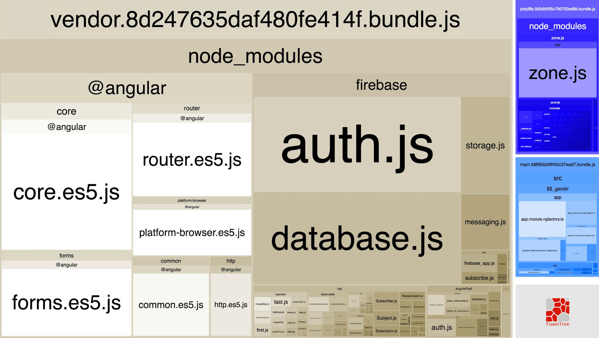
If you’re considering adding code splitting/lazy loading to your application, it’s probably a good idea to keep an eye on your bundle size from time to time. There are a number of different community-built tools that can make this easier, such as Webpack Bundle Analyzer which shows a visualization of how different parts of your bundle are larger/smaller than others with a treemap.
Metrics
With regards to load times, using metrics can be important to set a baseline on how well our webpage loads for different users. Some important metrics to consider are:
- First Meaningful Paint: The time it takes the user to see meaningful content on their device.
- Time to Interactive (TTI): The time it takes for the JavaScript thread to settle and the user can interact with the application.
As developers, many of us have become accustomed to building web applications with healthy network connections and powerful machines. At times, we may not realize how users would experience our applications with lower-end devices and weaker connections. According to a Google Research statistic, the average time it takes to fully load a webpage on mobile is greater than 20 seconds. This was found by running tests on a globally representative 3G network connection and a Nexus 5 device. Another Google Research statistic found the average load time to be 15.3 seconds with a 4G connection.
If a webpage takes longer than 3 seconds to load, more than half of our users will give up.
Conclusion
It’s important to first spend a little time analyzing the devices of our users before adding performance enhancements that very well may not be necessary (or important as other features our application needs). If we find out our application is not loading as fast as it probably should after a little digging, then it may be worthwhile to dive in and try adding some optimizations!
If you have any questions or suggestions, feel free to open an issue!